Project Description
CATTAIL ORGANICS
BRAND IDENTITY + STRATEGY + ILLUSTRATION
OVERVIEW
Cattail Organics is a woman-owned organic farm in central Wisconsin that grows high quality organic vegetables, herbs, and cut flowers and produces maple syrup on a 50-acre diversified certified organic farm. Cattail is a leading Community Supported Agriculture (CSA) provider in the region and supplies to various stores, schools, food banks and local restaurants. In addition, you can find Kat, the Farm-Her, at the Wausau farmers market.
CHALLENGE
Like any farmer or gardener will tell you, growing is an art of patience. The journey from seed to harvest is what makes the process so worthwhile – facilitating the growth every step of the way. A single seed is nurtured into abundance to feed many, simply magical! Though we can only boast of a small home garden, we can understand the labor of love and have deep respect for the Cattail journey. With our work, we’ve helped grow the brand from it’s initial seedling, to a beautiful logo design and eventually to a complex brand identity over the course of the last five years. It’s been exciting to watch and help her brand (and produce selection) grow season after season.
SOLUTION
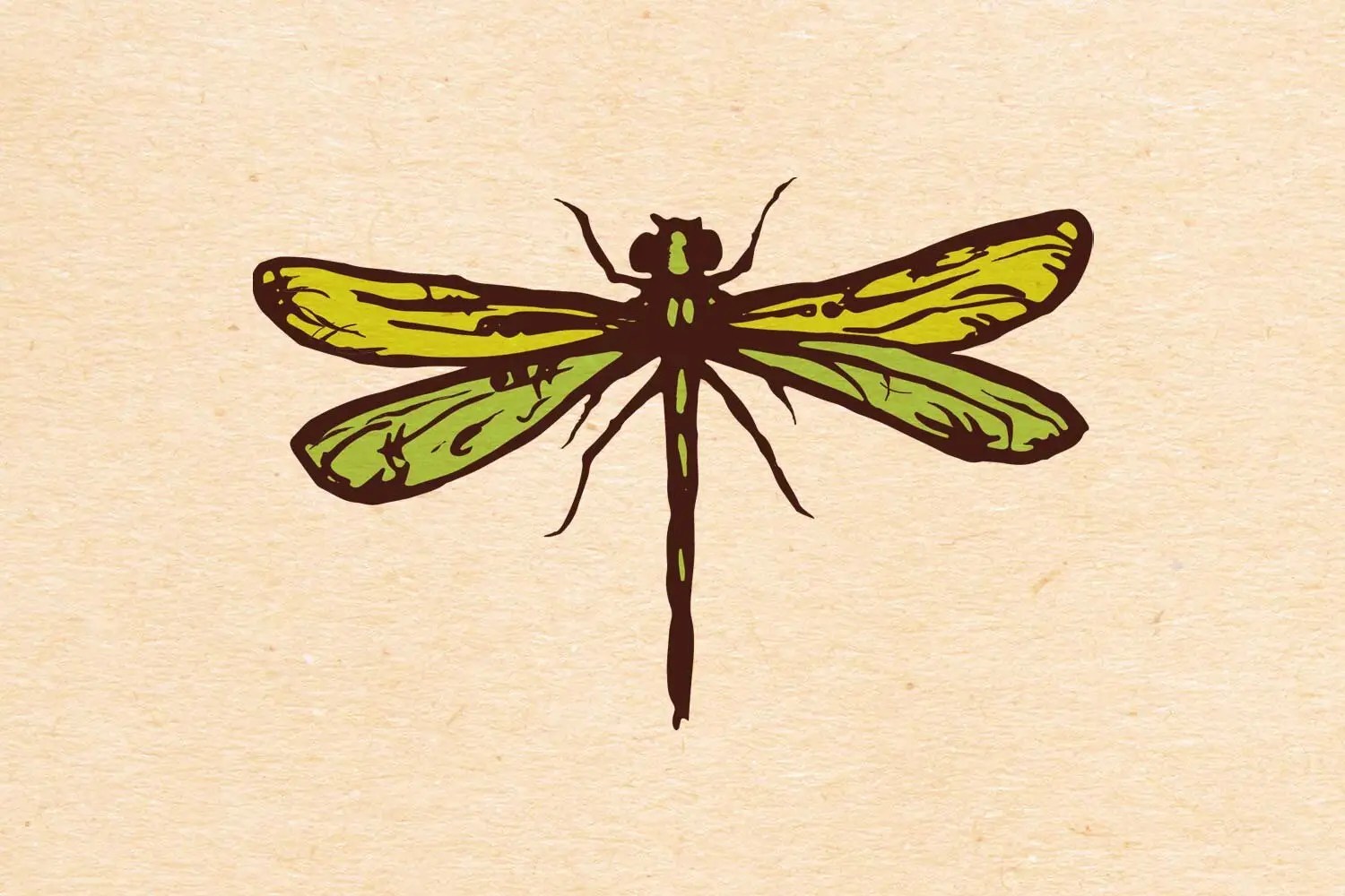
The name of the brand Cattail Organics was derived from the name of the founder, Kat. Cattails were a natural selection for the logo and branding. To expand the branding, a natural color scheme was employed along with organic elements. Various design elements were created to intentionally look unrefined with soft edges and bright colors, inspired by the natural bounty of the nourishment from Cattail Organics’ produce.


